Since the early days of 3D gaming, level designers have struggled with the challenge of showing players where they can, should, or must not go in a three-dimensional environment.
In older 2D games, even the more complex Metroidvanias typically had players moving left or right. Some games allowed vertical movement, but the edges of maps and interactive elements were often obvious due to the limitations of the two-dimensional space.

However, the shift to three-dimensional worlds created a need for more nuanced and intuitive ways of guiding players. You’ve seen these visual cues before, right? For instance, if you spot a barrel or another container painted red, you know what has to be done, don’t you?
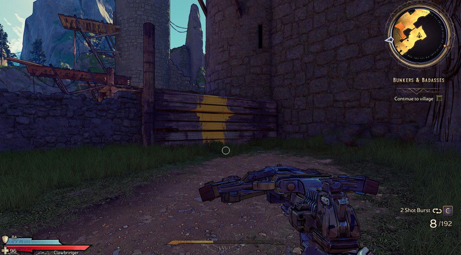
And if you notice an edge painted yellow? You instantly recognize it as climbable. But why yellow? And why do some players have an aversion to it?
That’s what we’ll be exploring today: the concept of "yellow paint" in video games. If you have any questions, leave a comment.
The Origins of Yellow in Video Games
Although yellow paint in games might seem like a recent innovation, its roots trace back to design conventions from earlier titles. For example, Tomb Raider (1996) and Prince of Persia: The Sands of Time (2003) included climbable elements, but players often had to rely on trial and error since developers had not yet introduced consistent visual cues. Some edges were textured or had additional details to hint at their climbability, but these weren’t always easy to spot.
As third-person action platformers gained popularity, especially those involving parkour and vertical exploration, developers began to incorporate bold colors to guide players. Classic titles like the original Final Fantasy VII also used navigation aids, such as colored markers, although in different forms.
Yellow became the preferred color for a reason: it is vibrant, highly visible, and contrasts well with many environmental backgrounds, including urban, forest, or industrial settings, which are often dominated by muted tones like gray, blue, and green. Imagine trying to spot a patch of blue paint in a space-themed environment... it just wouldn’t work.
Additionally, yellow has psychological associations with attention and caution, much like traffic signs, making it a natural choice to signal interactable areas without requiring verbal instructions or tutorials.

When DICE launched Mirror’s Edge (2008), the use of color-coded guidance reached a new level. The game introduced a mechanic called Runner’s Vision, which highlighted objects, such as pipes and doors, in red to indicate areas the protagonist, Faith, could interact with directly. Yellow, however, was subtly used to show scalable paths, footholds, and jumping points.
The success of Mirror’s Edge influenced future titles, creating a design standard that is still widely used in the gaming industry. This approach reflects the industry’s constant efforts to simplify gameplay experiences and ensure seamless progression through narratives, demonstrating the ongoing evolution of game design.
The Establishment of Yellow in Action-Adventure Games
Although it’s challenging to determine which game first used yellow to mark climbable points, influential titles such as Mirror’s Edge and Uncharted were instrumental in popularizing this design choice. These games established a visual language that helped shape the intuitive gameplay experiences seen in later titles. Following Mirror’s Edge, the use of yellow as a subtle guide became common practice. Examples include:
- Uncharted 2: Among Thieves (2009) and its sequels implemented yellow edges and worn surfaces to mark climbable areas. Players controlling Nathan Drake often encountered ledges and beams with yellow paint, making navigation intuitive without relying on lengthy tutorials.
- The reboot of Tomb Raider (2013) and its sequels used a similar approach, marking platforms and climbable surfaces with yellow. The series also incorporated a survival instinct mode, similar to Mirror’s Edge’s Runner’s Vision, which players could activate to highlight important interactive areas.
- Dying Light (2015), a parkour-based zombie survival game, utilized yellow markings to indicate viable paths in the environment, allowing players to quickly find escape routes.
- The Horizon Zero Dawn series (2017) highlighted climbable objects with yellow paint while marking critical technology-related paths or doors with green lights.
- The Last of Us (2013) relied on yellow markings to guide players along pathways, interactive objects, ladders, and other critical routes.
Modern games continue to refine this method. For instance, Cyberpunk 2077 (2020) makes extensive use of yellow to mark unlockable doors and interactable elements. Similarly, God of War: Ragnarok (2022) employs subtle yellow indicators, such as scratches and paint, to highlight scalable areas, ensuring the gameplay remains immersive and intuitive.
The Yellow Paint Debate
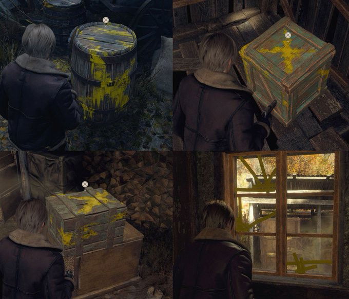
Pinpointing the exact moment when the yellow paint debate in video games began is tricky, but we can look at March 11, 2023, as a key moment. On that day, Twitter user FPSthetics sparked a discussion by tweeting four images from the Resident Evil 4 remake with the caption, “This has to stop.” The post received over 16.6 million views, 15,000 likes, and 2,000 replies in seven months. However, the debate didn’t gain much traction beyond that.

The conversation resurfaced on October 2, 2023, when Twitter user feydemon shared a photo of a ladder from the same game, covered in streaks of yellow paint. The user wrote: “The yellow paint is so unnecessary. Obviously, a ladder is climbable. Obviously, a box is breakable. Why would they do this?”
This post criticized the trend of highlighting interactive objects that are already self-explanatory in games. It gained over 2,900 reposts and comments and 3,700 likes in just four days.

At first glance, the purpose of yellow paint seems simple: to guide players through game environments by marking interactive elements like scalable ledges and traversal paths. However, its apparent overuse has sparked debates about its impact on immersion and gameplay. While some believe it simplifies navigation and enhances accessibility, others argue it breaks the illusion of virtual worlds and interferes with the seamless integration of gameplay and storytelling.
Before diving into the heart of the debate, it is important to address a few misconceptions about yellow paint. Contrary to what the "hardcore pro gamer 'I hate casuals' " crowd might think, this feature is not just the result of lazy developers or poor design choices. It fulfills an essential role in making games more inclusive for players of varying skill levels (which this demographic tends to oppose, as they believe games should remain exclusive to an "elite group of gamers" they imagine themselves to be part of).
In today’s gaming landscape, where inclusivity is a growing priority, yellow paint serves as a helpful tool for players with visual or cognitive impairments, such as color blindness. By providing clear navigation hints, it reduces frustration and improves the overall experience for players of all abilities (and, as a side benefit, helps games sell better).
To truly understand why yellow paint exists, we need to confront an inconvenient truth about modern player behavior: the lack of focus. Let’s be honest: can you sit through an entire two-hour movie without reaching for your phone at least once?
With declining attention spans and companies like Netflix designing movies to work as “second-screen experiences,” game developers are forced to find ways to retain player engagement. In this context, yellow paint acts as a strategic tool to keep casual players interested and prevent them from quitting too early in frustration.
There are also arguments that yellow paint disrupts immersion and ruins the aesthetic appeal of games. For players who enjoy exploration and discovery without guidance, highlighted objects or paths can detract from the sense of achievement. They argue that part of the fun lies in observing the environment and figuring out solutions independently.
Another concern is that the frequent use of visual markers could lead to over-reliance. Players might begin to ignore other game design elements, like environmental storytelling or subtle visual cues, which could provide the same guidance in a less explicit way.
Inclusion vs. Challenge: Can These Be Balanced?
As discussions about yellow paint continue, it is crucial for developers and players to find a middle ground. Disagreements are inevitable, but constructive dialogue can pave the way for creative solutions that cater to different preferences.
Many players criticize games where environments visibly guide the player too much, but this level of guidance is undeniably beneficial for those with specific needs or difficulties. Getting lost or stuck while trying to figure out where to go next can be a frustrating experience. Moreover, accessibility is an essential aspect of game design.

Unfortunately, some players react negatively to the topic of accessibility, equating it with “political correctness” or “woke culture.” They insist that games should only cater to a narrow “hardcore” audience that doesn’t need help or guidance, supposedly because they are “superior” players.
This mindset often stems from arrogance or a lack of varied hobbies, interests, or even social interactions. A person with a busy work schedule doesn’t have the time or patience to “challenge themselves” by wandering aimlessly in a pitch-black, obstructed corridor. They simply want to have fun and unwind after a stressful day.
Some developers have started experimenting with alternatives to provide player guidance while preserving immersion. These methods include strategic use of lighting, subtle differences in the color or texture of objects, and carefully crafted environments that naturally direct the player’s focus. These approaches aim to balance accessibility with a satisfying level of challenge.
Whether through subtle design details or alternative techniques, the ultimate goal remains the same: creating fulfilling gaming experiences that engage both hardcore players and casual ones. The debate over yellow paint in video games underscores the complex interaction between accessibility, aesthetics, and player engagement.
While opinions on the matter may vary, it is essential to acknowledge the broader implications of this debate. By prioritizing inclusivity and adapting to the shifting needs of modern audiences, the gaming industry can continue to innovate and deliver a diverse range of captivating experiences.
What’s your take on yellow paint in video games? Does it disrupt or enhance gameplay? Share your thoughts in the comments and let’s dive into this topic together!


— Comments 0
, Reactions 1
Be the first to comment