Ever heard the saying, "Don't judge a book by its cover"? It applies to games too. After all, you often can't tell exactly what a game is about just by looking at its box art. And these are some of the most common cases of strange covers. You can't look at a crooked guy with a pistol and associate it with Mega Man, or see an orange cover with the number 2 and know it's Earthbound.
Box art variations are cultural or marketing issues that attempt to bring a product closer to a specific audience, but sometimes they end up stumbling upon cultural issues or the lack of knowledge of those working on the game. Sometimes the changes are even good, but in most cases, they end up not being so successful. Let's talk about some box art covers that changed from one region to another and why. If you have any questions, leave a comment.
Mega Man (NES)
The original Mega Man released for the NES is probably the most mentioned example when talking about a box art that has nothing to do with the game: while in Japan the hero has anime features and a look consistent with what we see on screen, the North American cover shows a man with strange features, a crooked body, changed colors, and even a handgun.
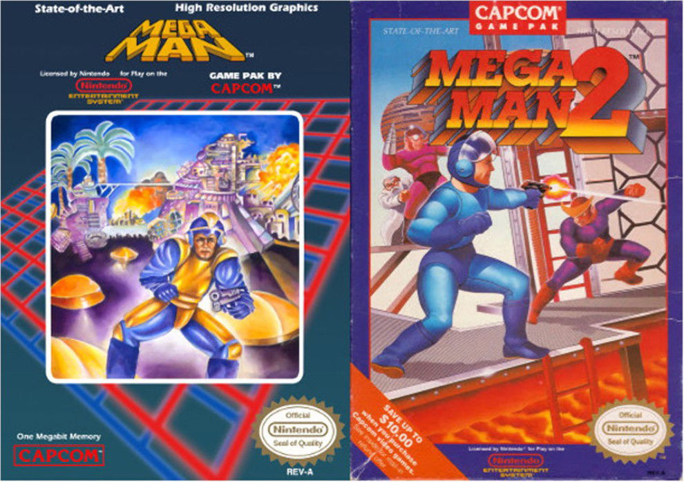
The explanation stems from tight deadlines and marketing decisions by Capcom USA; the artwork was rushed and became notorious for its "strange" aesthetic. This cover ended up on lists of the worst box arts of all time, and the "crooked" Megaman even appeared in Street Fighter vs. Tekken. And in Megaman 2, they went back to work, making the robot look like an extra from the Tron franchise.
EarthBound / Mother 2
EarthBound (Mother 2 in Japan) had very different approaches: the American cover of EarthBound is psychedelic and focuses on Starman (with Ness reflected in the helmet), while the Japanese cover has only the logo on an orange background and a giant 2. How this minimalist cover translates the game to an Eastern audience is unknown.
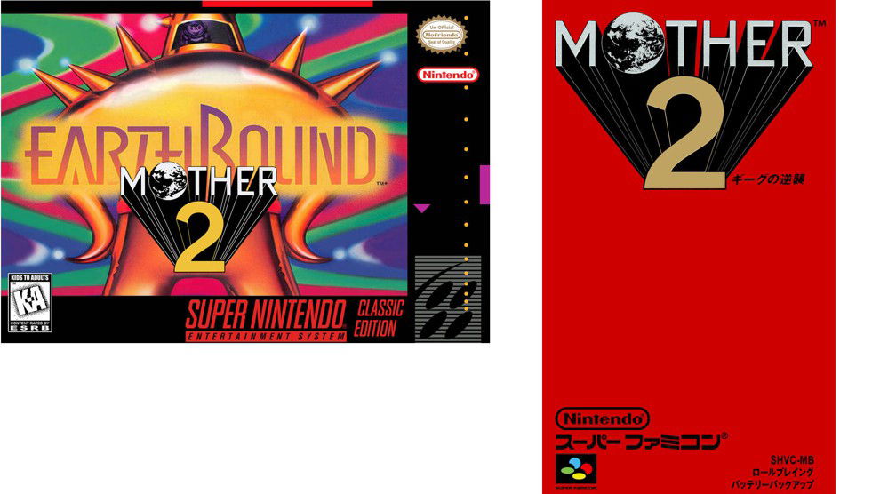
Part of the difference can be explained by Nintendo of America's attempt to adapt the game's vibe to a Western audience in the 1990s, as well as aesthetic decisions that prioritized a flashy image on shelves.
Left 4 Dead 2
The original cover for Left 4 Dead 2 showed a hand with only two fingers raised—signaling the "2" in the title. Simple, right? But things got complicated.
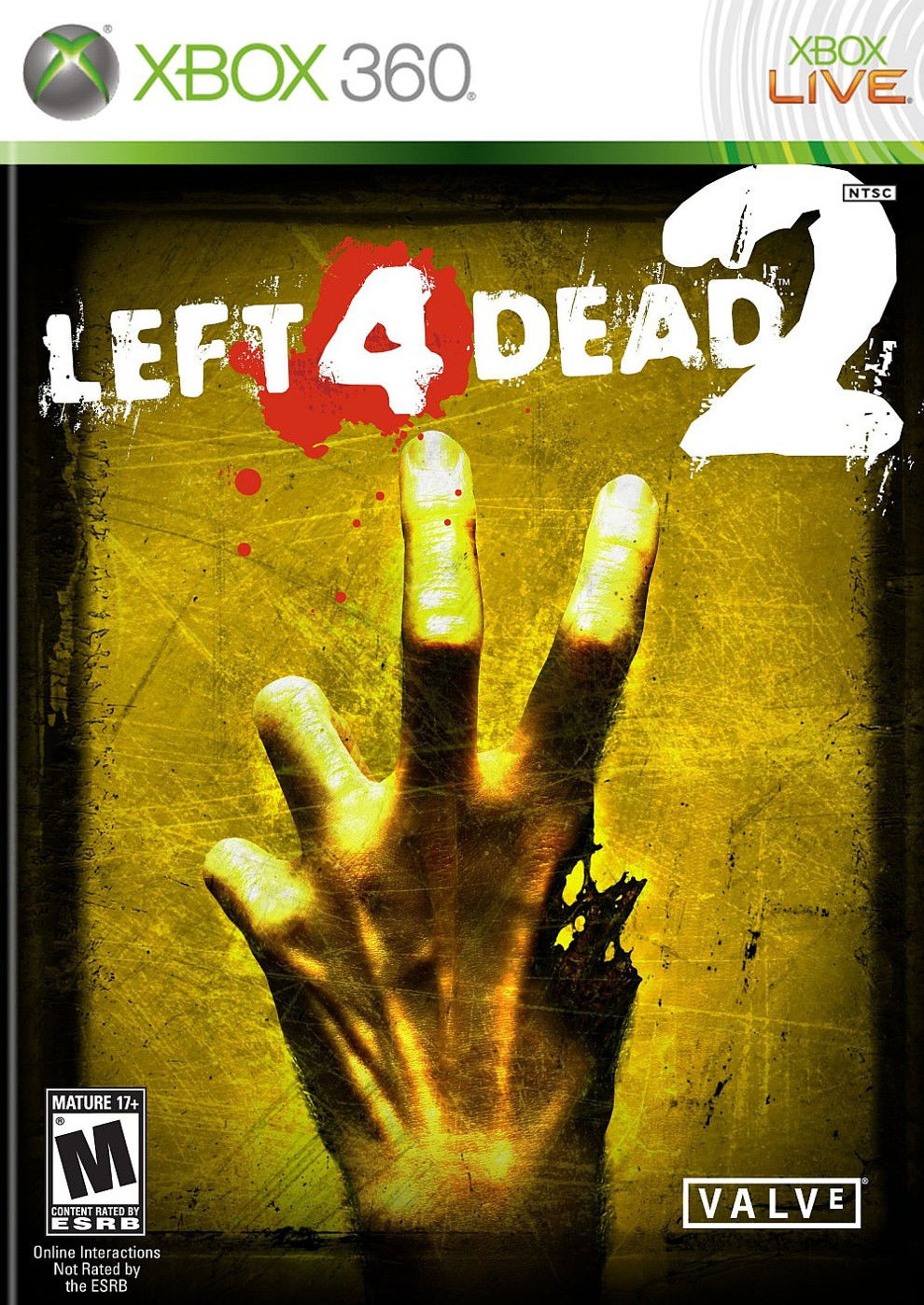
In Europe—especially the United Kingdom—the gesture of "two fingers raised with the hand facing the person" is considered obscene. The solution? The hand was inverted, showing the palm, the fingers curled, the thumb still "wounded," and the two fingers raised, facing inward—avoiding cultural misunderstanding.
The origin is attributed (although disputed by historians) to the Hundred Years' War between England and France in the 14th and 15th centuries. Popular legend has it that English archers used longbows and needed their index and middle fingers to shoot. When captured, the French cut off these two fingers to prevent them from continuing to shoot arrows.
So, on one side, we had the English showing their fingers to say, "I can still kill you," and the French showing their fingers to remind English soldiers of what they had lost. All of this was due to a local sign language. A simple image involved multiple edits and cultural care—a veritable dance of design geared toward regional adaptation, but with embedded social meaning.
Kirby
In the 1990s, the Kirby character underwent a visual transformation in Western marketing material: while in Japanese art Kirby is almost always cute and smiling, some American covers and campaigns showed him with furrowed eyebrows and a "determined/angry" expression.
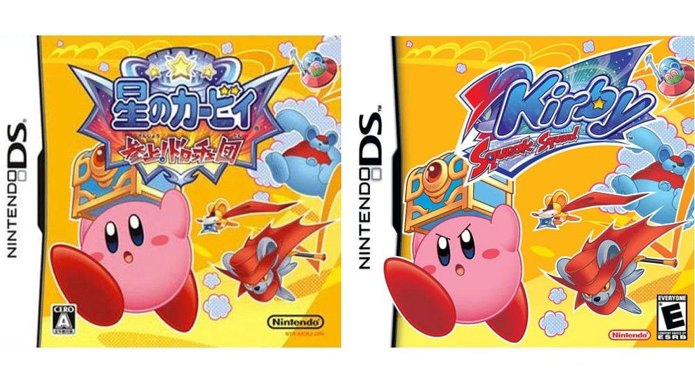
The reason given by those who worked with the franchise is a product positioning strategy (trying to communicate action and appeal to a young male audience that wouldn't like something "cute") — a marketing decision that, in the long term, affects the industry to this day, with "angry" characters on game covers and even becoming the subject of a Polygon report explaining the origin of "angry Kirby."
Phalanx (SNES)
Phalanx is an early 90s space shooter whose European marketing material featured an unusual image of an elderly man playing the banjo on the cover—a deliberate choice to differentiate itself on the shelf and attract attention in a sea of shooters with similar art.
“"We knew the game didn't have much to offer, but we wanted to make the package attractive. Keith called this the 'heavy 'huh' factor. If nothing else, we'd try to get the potential buyer to look at the package and try to figure out what happened. Today, it might be called the 'What the f.....' moment."”
- About the Phalanx cover
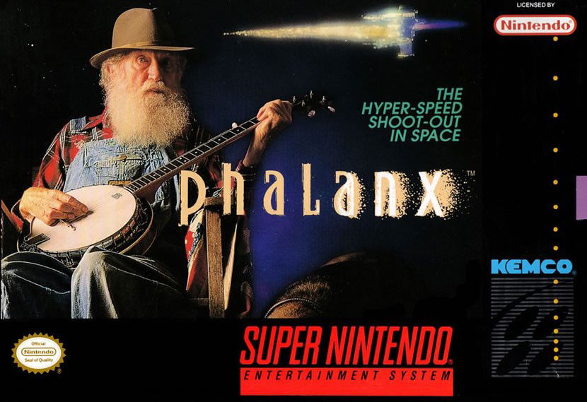
The story became a case study: the box art was approved with the aim of "confusing," and while it may seem absurd, it served its purpose of creating meme-like appeal and brand recall. Today, it's featured in lists and articles about strange covers and their commercial logic and even received an explanation from Nintendo Life about the game's box art.
Ōkami
Ōkami is another example where the Western version underwent visual changes that angered fans: European and Japanese box art have very flowery and decorative compositions; the American version, at a certain point, came out with a more simplified treatment (and was even distributed with an unknown: the accidental presence of a watermark in the initial art).
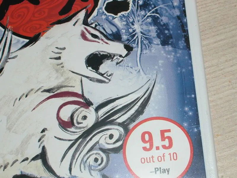
Capcom ended up offering alternatives and corrections, but the episode became news and generated debates about respect for the original artistic directive, and the coverage of the incident at the time was the subject of an article on the website Engadget.
Pokémon Red/Blue
Bringing the pocket monsters to Western audiences and translating the strategy of differences between the two titles onto the cover must’ve been no easy task for Nintendo. Initially, they decided to switch the "franchise protagonists." While in Japan, the game had Red and Green versions, featuring Charizard and Venusaur on the cover; in the West they switched to Red and Blue, with Blastoise replacing the grass-type Pokémon.
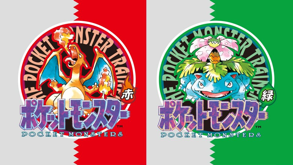
This strategy of emphasizing the rivalry between two elements, like water and fire, gave the game its identity today, featuring two complementary versions featuring exclusive monsters that could be swapped using the link cable connected to the Game Boy. Perhaps the change from Green to Blue was made so no one would be tempted to set the grass on fire? Maybe. But whatever the reason, it worked.
Suikoden (PS1)
The RPG Suikoden, released in Japan in 1995, featured vibrant, character-filled anime-style box art, highlighting the game's massive cast and conveying the feeling of an epic adventure. It was a visual invitation to explore a rich and diverse world, with vivid colors and detailed composition. It was a cover that perfectly reflected the game's idea, but for some reason, North American fans didn't agree.
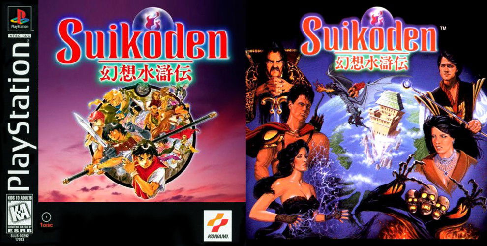
In the American version, this art was replaced with something entirely different: a bunch of realistic human characters, looking like a low-budget fantasy movie cover, with everyone wearing that serious, scowling expression, just like the Kirby one we mentioned above. The change stripped away all the energy and visual appeal of the original box art, resulting in a generic image that said little about what the player would find.
Ghost House (Master System)
In Japan, Ghost House's cover art directly reflected the game's theme: horror and adventure. The illustration depicted protagonist Mick battling classic monsters like vampires and mummies, using a cartoonish yet darkly atmospheric style, clearly conveying the atmosphere of terror the player would encounter. Each visual element connected to the gameplay, preparing the player for the experience to come.
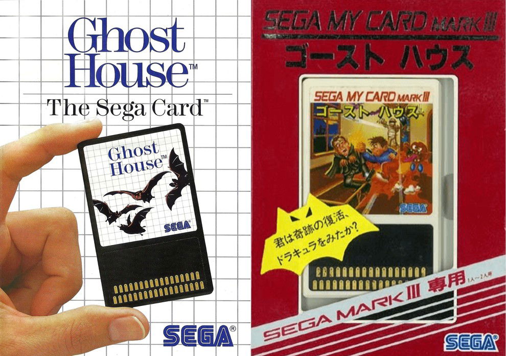
In the Western version, Sega adopted a strange pattern: showing only a small image of a hand holding a chip with bat images against a minimalist, uniform background. The change eliminated the visual narrative of the Japanese art, creating a much more generic presentation that revealed nothing about the game's content or atmosphere. Is this a game about a card with bat dice?
In Brazil, Tec Toy made an even more radical adaptation: the cover and the game were renamed Chapolim vs. Dracula: A Scary Duel, replacing Mick with the character El Chapulín Colorado, a Mexican TV icon popular in Brazil.
Renegade (NES)
Renegade, released on the NES, underwent one of the most curious design changes between regions. In the Japanese version, the game features Japanese high school students battling local gangs on the streets, with urban settings typical of 1980s Japan. The entire aesthetic of the game, from the characters to the environmental details, clearly reflected Japanese culture, with the typical "bad boys" and student delinquents, Yu Yu Hakusho-style.
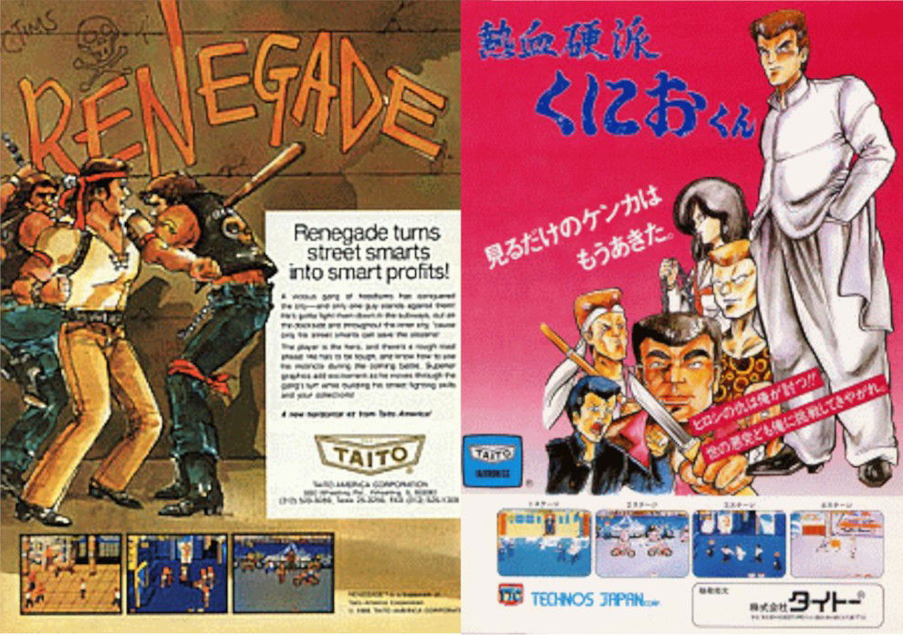
When the game was adapted for the American market, the changes were drastic. The characters were redesigned as gangsters, with clothing and attitudes associated with stereotypes of American urban delinquents. The setting was also modified to feel more "American," eliminating virtually all references to the original Japan.
The reason for these changes was the developer's attempt to make the game more relatable to Western audiences and, therefore, more commercially appealing. However, this adaptation resulted in a significant disconnect with the original content, transforming a fight between school juvenile delinquents into a fight between criminal gangs.



— Comments 0
, Reactions 1
Be the first to comment